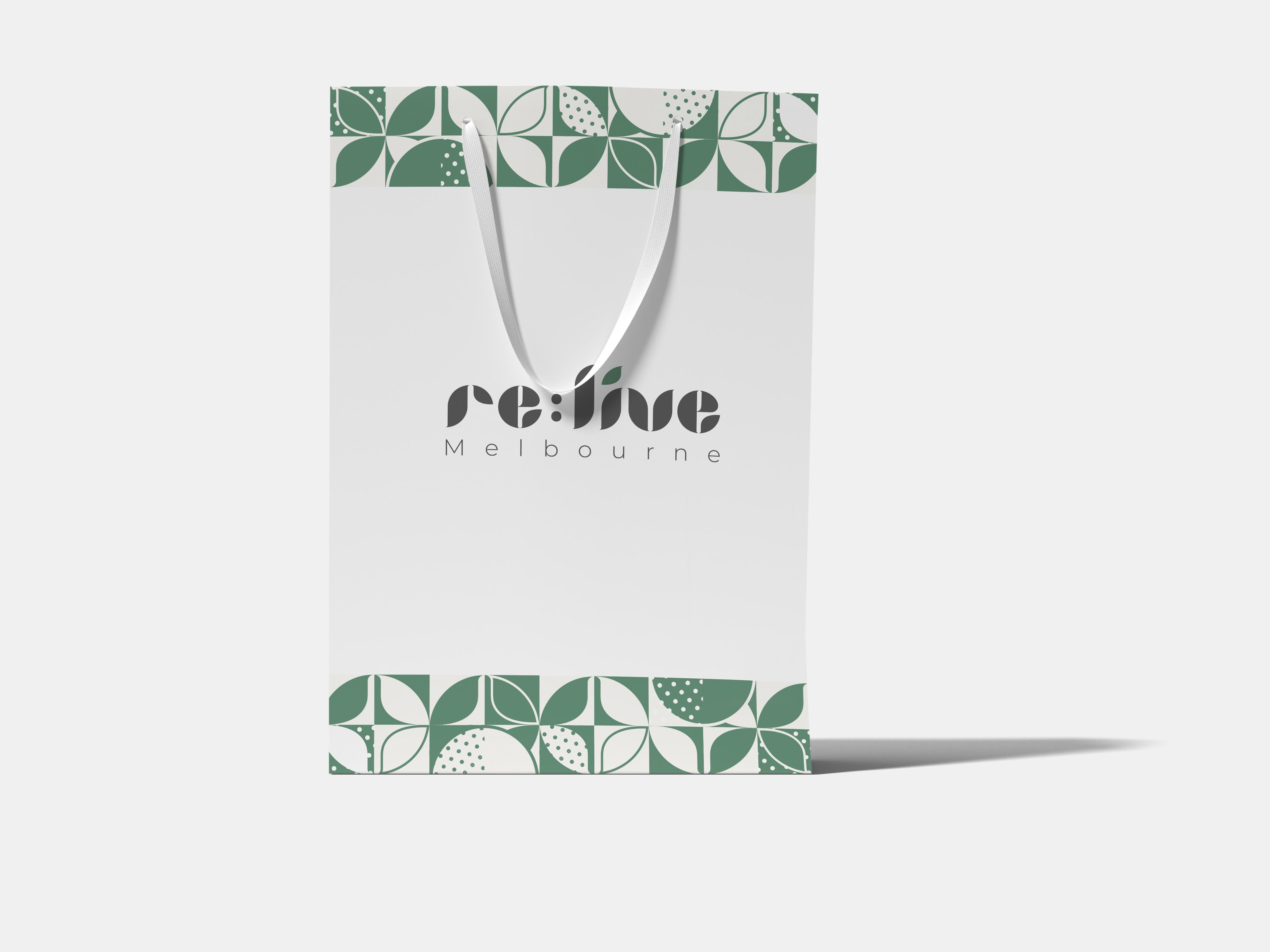
The aim of this project is to update and refresh current branding and packaging with a contemporary redesign that will renew appeal to demographic and increase feasibility.
Primary logo
Secondary logo with tagline
The founders of this clinic are originally from Italy. I have chosen the letter "V" from the Italian word "Verde," which means green. In this brand identity, green represents not only the herbs and plants used in their products but also embodies sustainability and natural elements, illustrating their core values.

